Castlight COVID-19 Test Site Finder


Background

On March 25, 2020, Castlight released a tool that can be accessed by anyone in the U.S. who is looking to find the closest Coronavirus testing site to their home. This tool contains guidelines on facility requirements on how to receive a COVID-19 test. The tool is crowd-sourced so that those who want to contribute can fill out a form about a new location or update information on a current testing site. Click here to the live website


Project

Shortly after the COVID-19 Test Site Finder was released, I got an urgent task to enhance the User Interface of the COVID-19 Test Site Finder in preparing for a potential collaboration with Google and Apple. The following screenshots can give you a high level idea of how the user interface has transformed from the first release (on the left) to the upgraded release (on the right) that is designed by me.
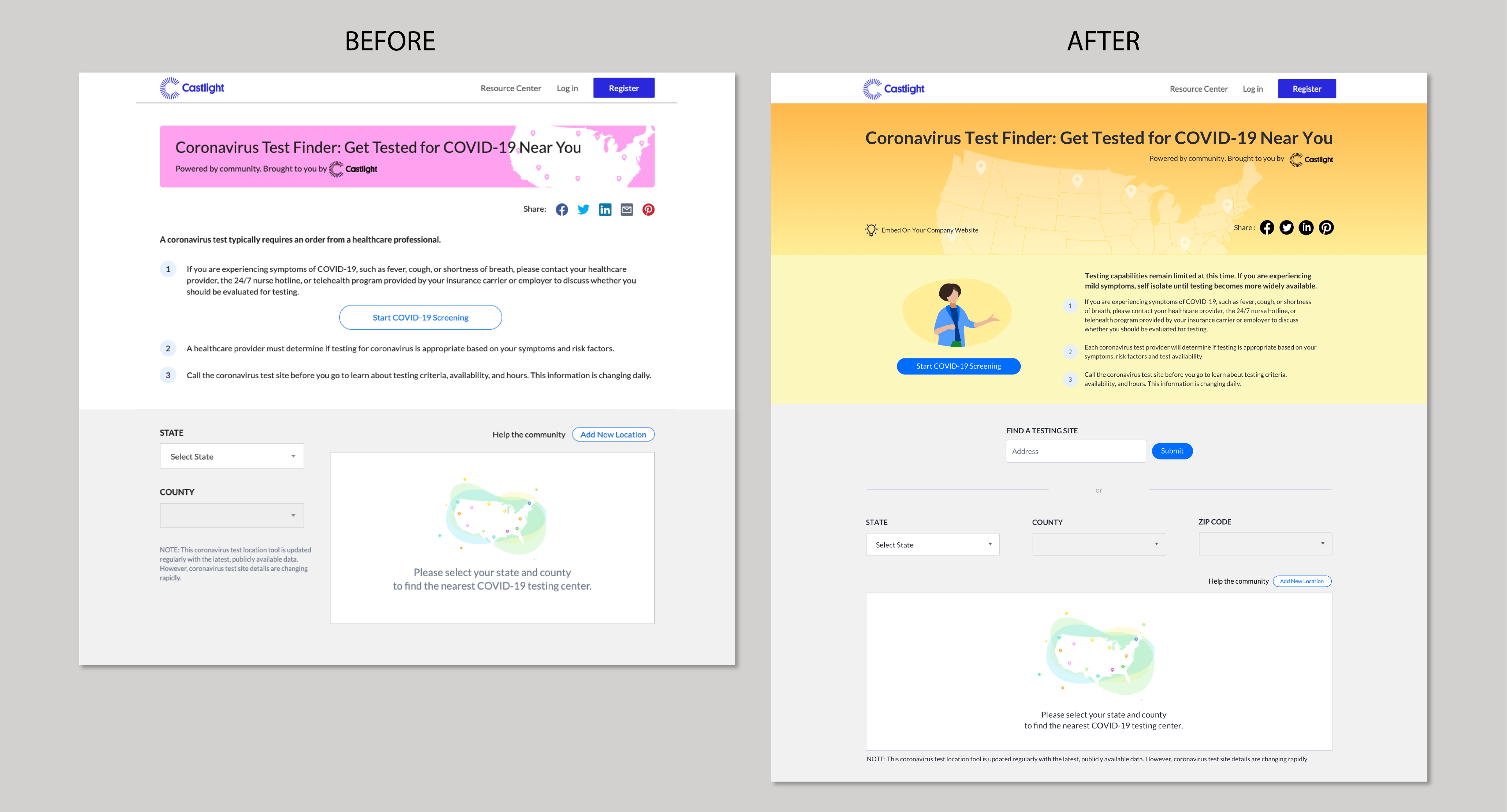

Process

  • Update color theme
Since the release of the pink theme, there have been many controversies. After synthesizing many opinions, we decided to choose a yellow gradient theme. Yellow has the meaning of early warning. Castlight brand colors are purple and blue, and the complementary color of purple is yellow. This combination will make the website look natural and coordinated.
  • Bring illustrations into UX design
Illustration is something I often use in my design work as it can be a useful tool to solve design problems. Since the content of guidelines on health facility requirements can not be removed or reduced any more, I can only optimize from the layout and visual. Illustration is an efficient way to convey a piece of information or a concept at just a glance, so it can provide a nice solution to this problem.
  • Integrate new feature 
As part of the redesign, we introduced a new feature which allows users to enter their address in the search bar to search for the closest COVID-19 test site location to their address in addition to the drop-down filtering by state, county and zip code.
My initial idea was to create two separate tabs for the two search modes that users can switch between as illustrated by the screenshots below. While this design makes the layout appear simple and clean, it may require users to take additional steps by switching between the tabs before they can find the content they need. Even worse, the search functionality in the inactive tab may be completely ignored by first time users who haven’t comprehended the product. In the end, I landed with the design of displaying both search modes on the same page.

  • Add more data in the facility view
We collected a large amount of data related to the COVID-19 test site, including business hours, facility type (hospital, community center, drive-thru, etc.), requirement type (appointments required or physician order required) and test type (assessment, specimen collection, home test, etc). As you can see in the screenshot at the bottom left, we did not display this data in the first version. We believe that this data is indeed very important and helpful to users, so bringing this data into the facility view is a feature we hope to include in the next release. The challenge of this task is how to add all the data in a limited space that doesn’t overwhelm users. The screenshot at the bottom right is the version we released on May 2 that is based on the upgraded design I made where we managed to add important data related to the health facility in the user interface.


  • Work with developers step by step to fix all issues we had for ADA (Americans with Disabilities Act) compliance
The Michigan Department of Health requested that the Castlight COVID-19 tester be embedded on its official website. Website needs ADA accessible to users across the U.S. We updated based on it including button color, font size, icon size, etc.

  • Results
To summarize, I redesigned the user interface of our COVID-19 Test Finder by adding a new mode of search-by-address, enhancing the health facility view with more facility data, and improving some features in an internal tool for facility collection. The new feature like facility filter, antibody testing that I’m working on is to launch soon. Click here to the live website
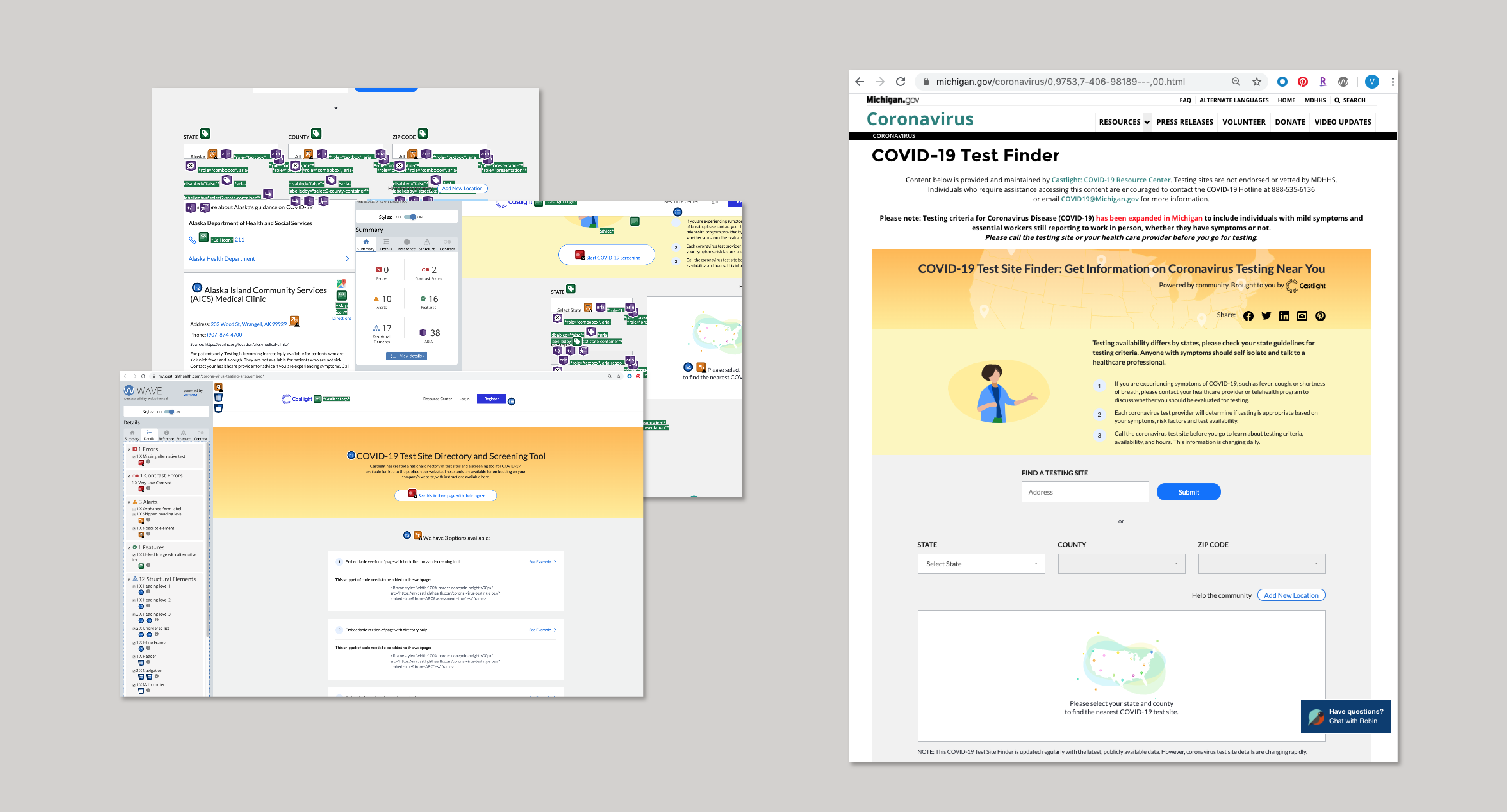
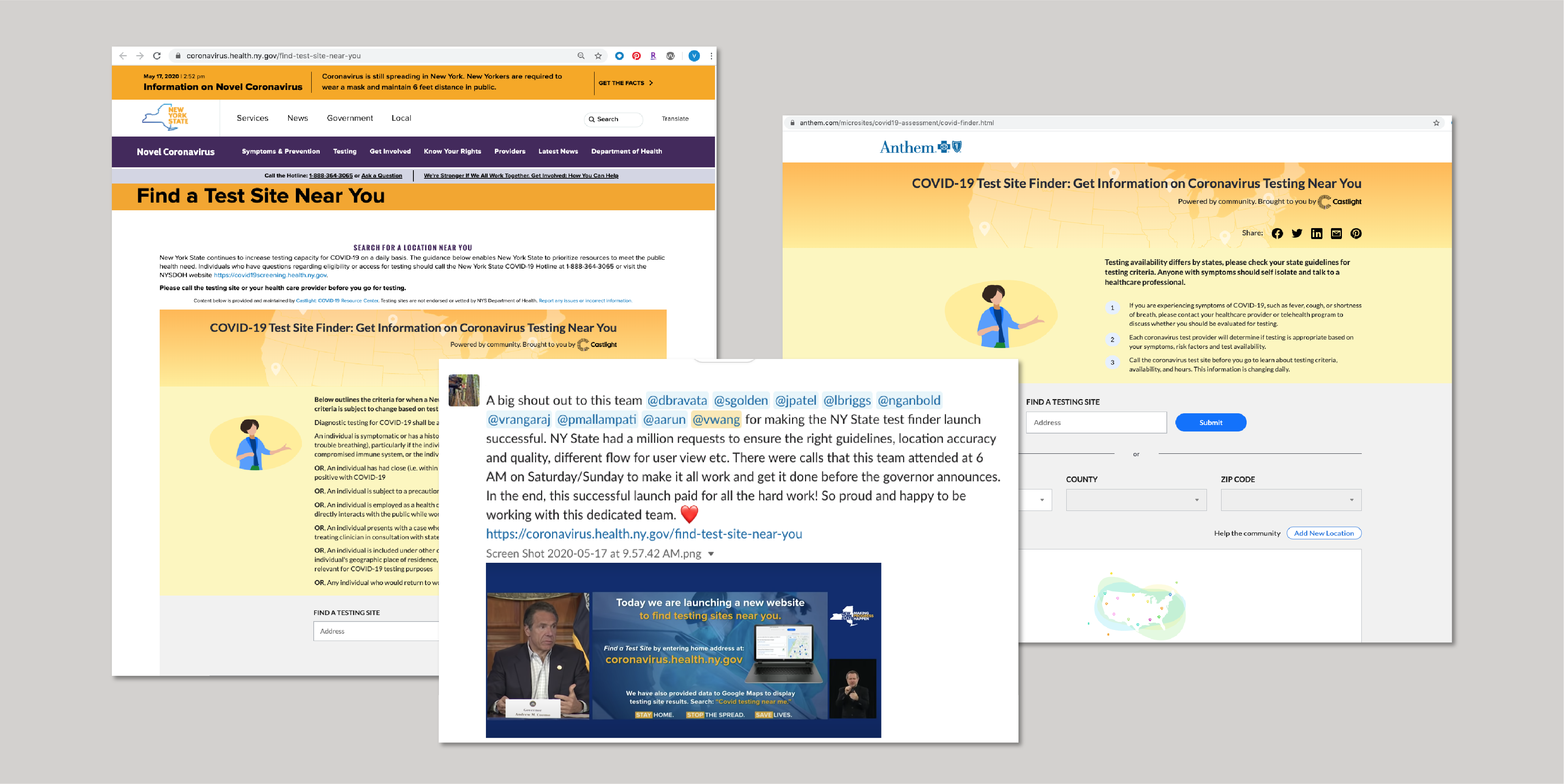
As of April 24th, we had 275k total unique users on our website, launched 17+ partnerships including some of the most prominent in the industry such as Google, New York State, Anthem, Michigan Department of Health, DaVita, Teladoc, 98point6 etc which has significantly improved our branding in the healthcare industry.


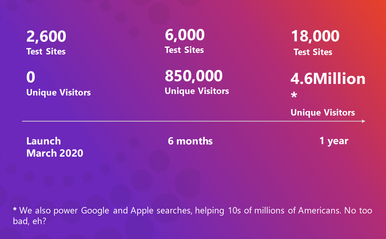
  • Test Site Finder - One Year


VIJIADESIGN.COM_SAN FRANCISCO_2023