Plastic Surgery on APPs
Is there any mobile application you use everyday that drives you crazy on certain features?
I listed mine and made improvements based on my own experience.
I listed mine and made improvements based on my own experience.
Background:
Mindbody business management software serves gyms, spas and salons worldwide, and helps people find and book with them. For business owners, Mindbody could grow their client base, manage schedules & accept payment. For users, Mindbody could find and book fitness classes near them with thousands of deals and studios to choose from.Issues
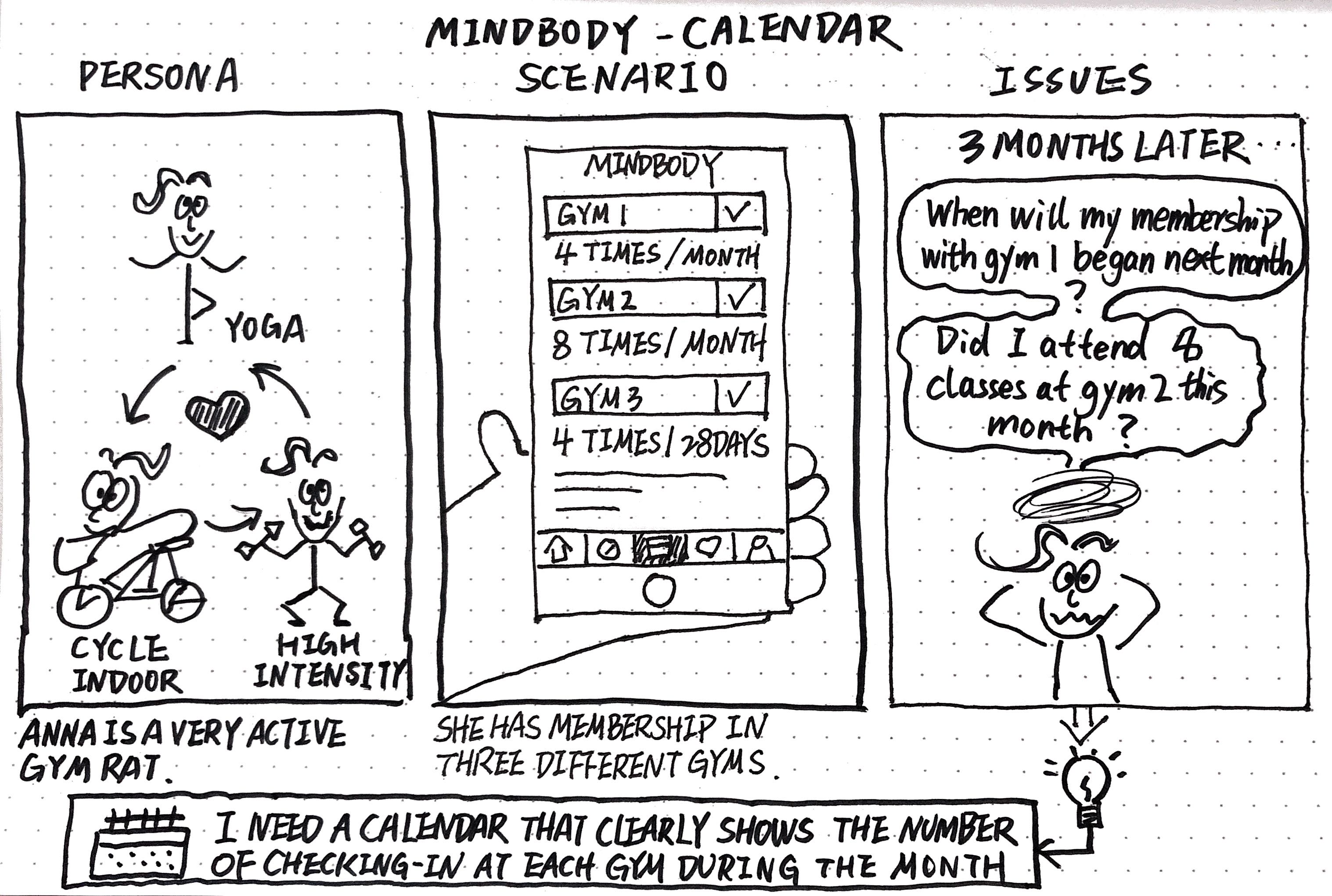
I use Mindbody a lot to explore new workouts. and have signed memberships with three different fitness centers via Mindbody. However, it is really hard to navigate through different memberships within the app because all activities are mingled together. For example, I had to manually count how many classes I have taken and how many classes left with each membership each month.Enhancement
I want to add more details of per-membership information in Mindbody's calendar, such as the duration of the membership pass, the number of classes I have taken, and the number of classes available for booking.Process
1, Sketch storyboard
![]()
2, Sketch the flow of setting a pass on calender
![]()
3, Analyze the existing application
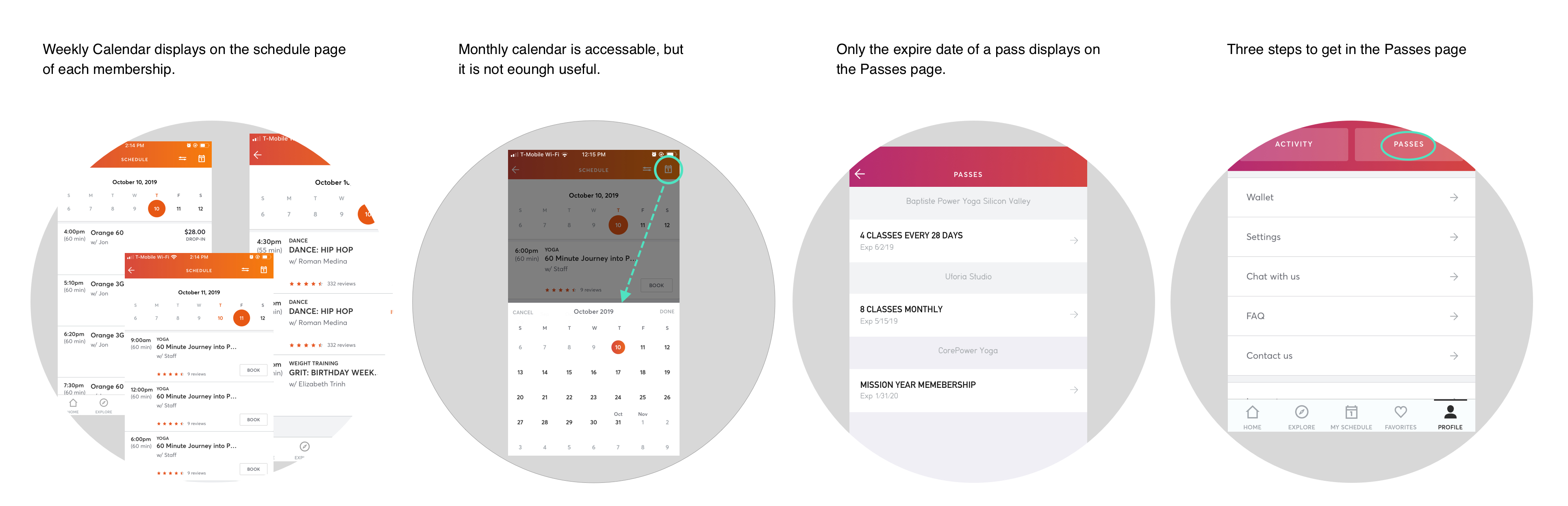
There is a calendar on the home page of each fitness center for users to click on the date and book the classes. Calendar has only a weekly view. You can tap the calendar and swipe left/right to find the class you want to book. There is no other information displayed in the calendar.
![]()
4, Define features
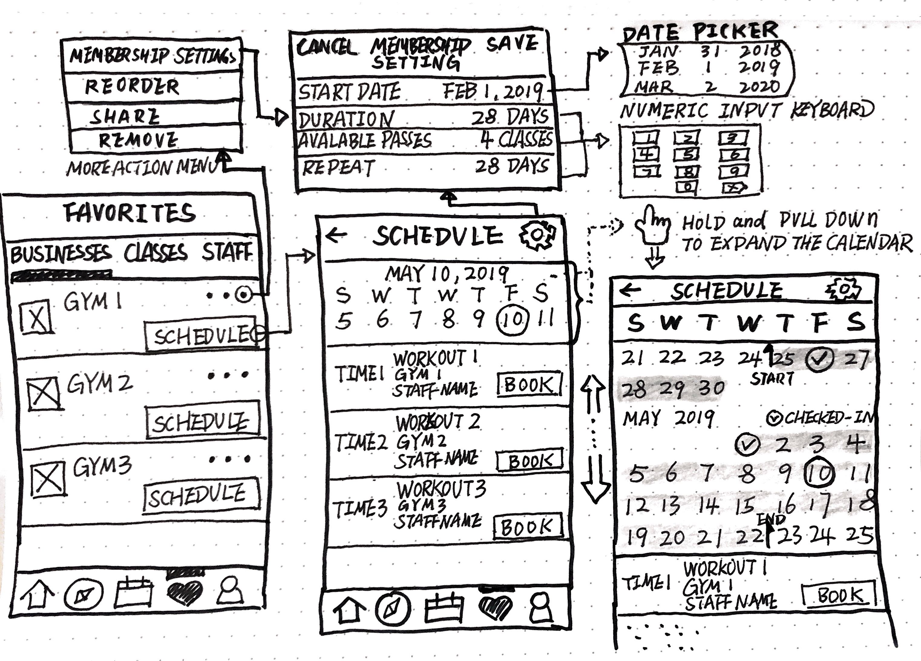
The feature I need is to help users view membership information while scheduling a class without having to jump to another page. The information includes the duration of the membership pass, the number of classes I have checked in, and the number of classes available for booking. I think the best solution is to display the above information directly in the calendar.
5, UI design
The essential issues to consider about UI design, going to improve the convenient and functional visual presentation of the information in the Calendar screen, were color palette and icons. As you can see, I chose reddish as the color of background for the duration of pass, which not only echoes the theme color, but also creates contrast with the bright orange active icons and black dates. Instead, the main operating area of the app uses white background which looks natural for the calendar and serves several important goals:
![]()
There is a calendar on the home page of each fitness center for users to click on the date and book the classes. Calendar has only a weekly view. You can tap the calendar and swipe left/right to find the class you want to book. There is no other information displayed in the calendar.
- If I want to know if my membership is still valid before I book a class, I must go to the Pass screen from the user profile page to check the expiration date of the membership of the fitness center.
-
If I forget how many classes I have already taken, I have to go to the history page to count on my own and then return to the homepage of the fitness center to book classes.
4, Define features
The feature I need is to help users view membership information while scheduling a class without having to jump to another page. The information includes the duration of the membership pass, the number of classes I have checked in, and the number of classes available for booking. I think the best solution is to display the above information directly in the calendar.
-
Expandable calendar: tap on calendar and swipe down to expand the calendar.
-
Display the details of the pass on the calendar: duration of pass, checked-in classes and available classes for booking.
-
Fast access to the history page by tapping checked-in dates in the calendar.
-
Tap the calendar and swipe up from the month view of the calendar to the weekly view.
5, UI design
The essential issues to consider about UI design, going to improve the convenient and functional visual presentation of the information in the Calendar screen, were color palette and icons. As you can see, I chose reddish as the color of background for the duration of pass, which not only echoes the theme color, but also creates contrast with the bright orange active icons and black dates. Instead, the main operating area of the app uses white background which looks natural for the calendar and serves several important goals:
- it supports high level of readability and quick perception of digitalr-based content.
- it provides the great area of creating prominent contrast for key interaction elements, such as icons and clickable dates;
- it adds the space and white space to the screen, helping to avoid the feeling of the screen overloaded with information.

6, UX design
The most critical part of implementing such a calendar with interactive information is the detailed setup process where we need to consider various factors. For example, for the duration of membership, some are calculated on a daily basis, some are calculated on a monthly basis, and some are calculated on an annual basis. Besides, the starting dates of memberships are different. All these factors need to be taken into account. I ended up referencing the setting of “Recurrence” on Outlook meeting schedule.
![]()
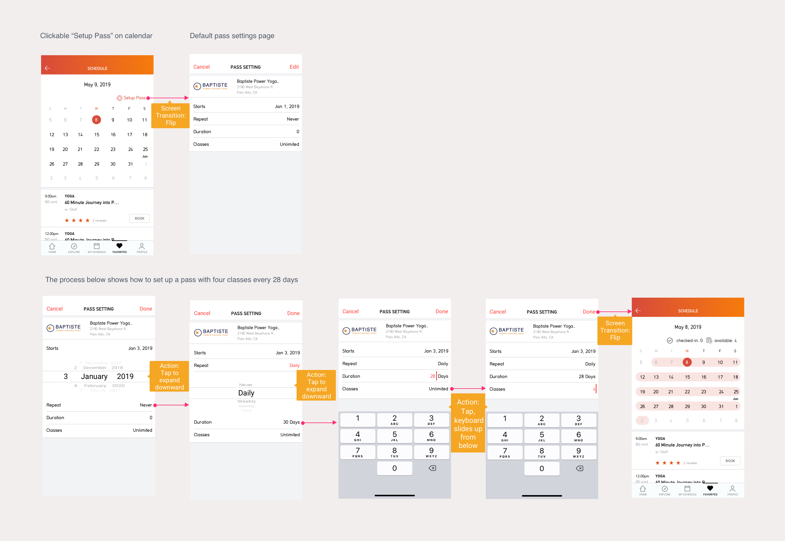
The flow below is an example of how to set up a membership pass that is calculated on a daily basis.
![]()
The most critical part of implementing such a calendar with interactive information is the detailed setup process where we need to consider various factors. For example, for the duration of membership, some are calculated on a daily basis, some are calculated on a monthly basis, and some are calculated on an annual basis. Besides, the starting dates of memberships are different. All these factors need to be taken into account. I ended up referencing the setting of “Recurrence” on Outlook meeting schedule.
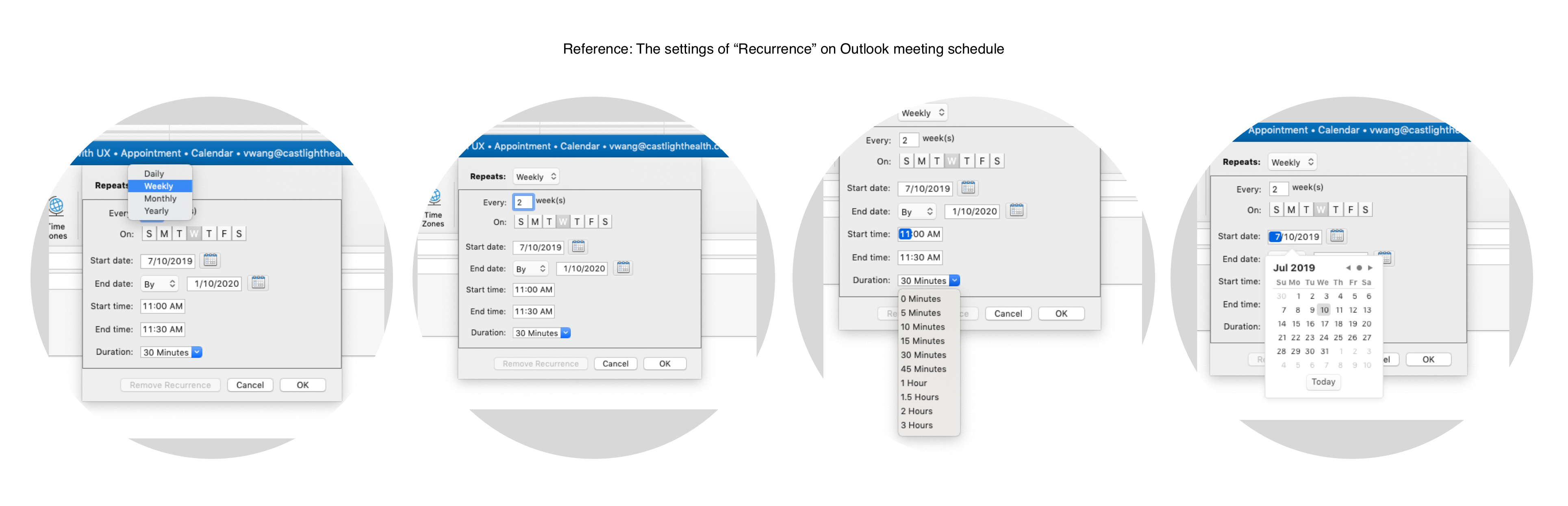
The flow below is an example of how to set up a membership pass that is calculated on a daily basis.
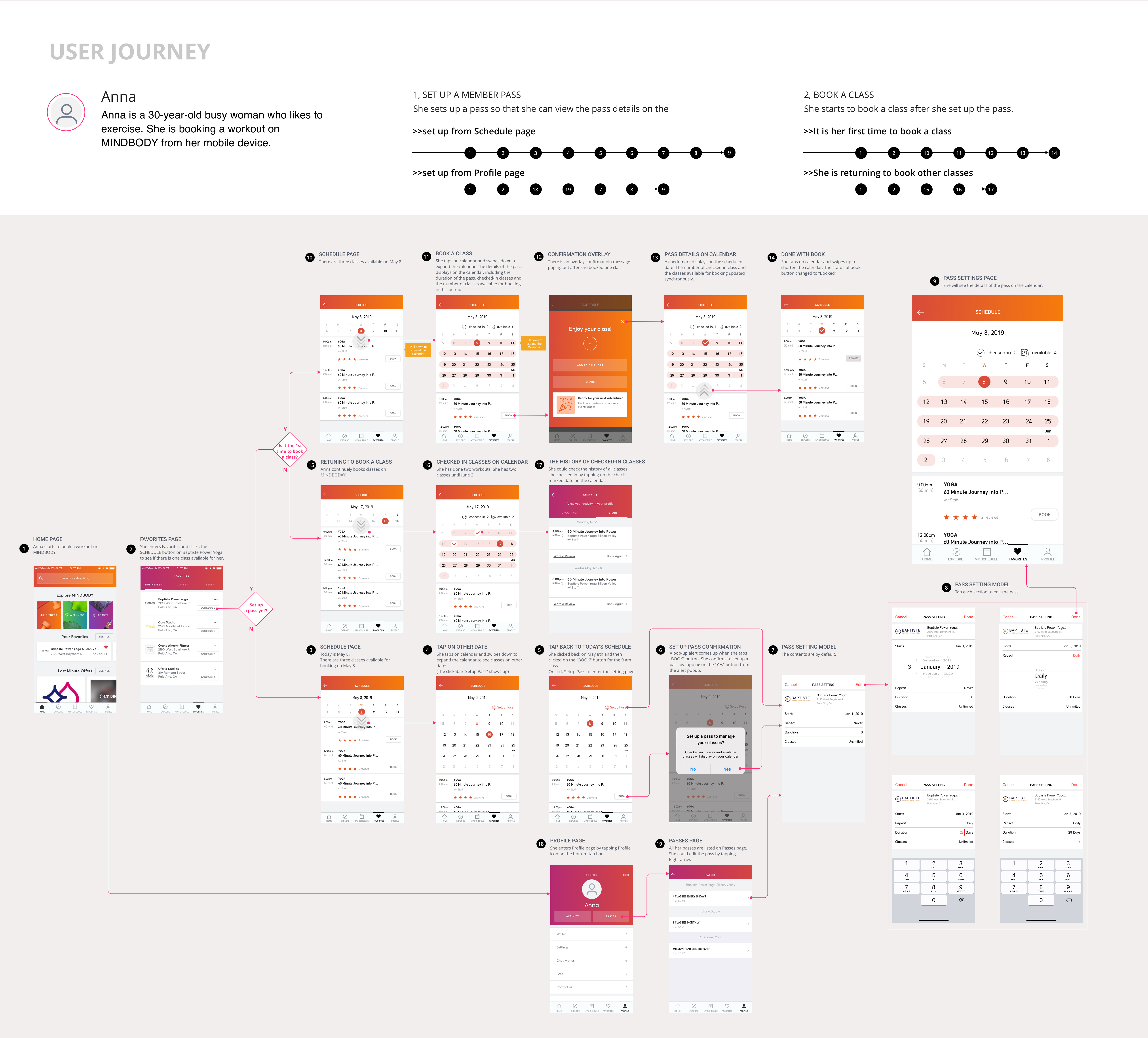
7, User Journey
![]()
-
The flow of setting up a membership pass
-
The flow of booking a class
Prototype
This prototype shows the first experience of setting up a membership pass in a calendar.VIJIADESIGN.COM_SAN FRANCISCO_2023